


Despite massive data investments, nearly 70% of Business Intelligence (BI) initiatives fail. In many cases, the culprit is not the data quality, but the interface. Hence, dashboard design best practices are a strategic necessity, not just an aesthetic choice.
At Fireart, we view dashboards as strategic tools. Yet, a disconnect often exists between raw data and actionable intelligence. This leads to confusing tools that sit unused.
Effective design is about cognitive ease. It respects the user’s mental energy.
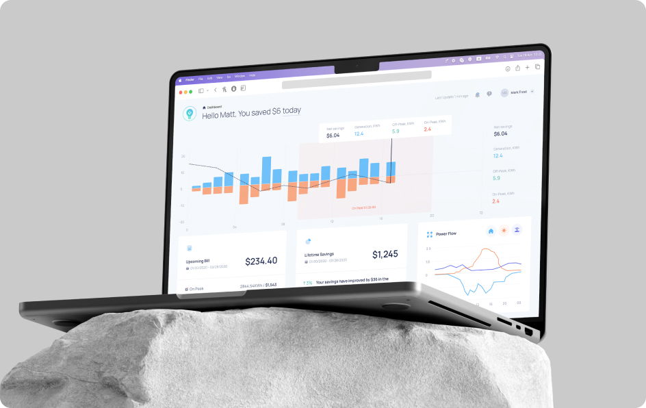
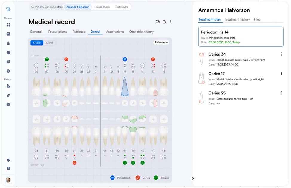
For example, on the Sprightful project, we transformed complex solar engineering data into an interface that homeowners could understand instantly.
In this article, we will share the principles that drive high-performance dashboards, and explain how your tools can drive business value.
Article highlights
Poor design is a financial liability. McKinsey research confirms that companies in the top quartile of design execution achieve 32% higher revenue growth, as superior UX prevents teams from abandoning BI tools.
Effective dashboards must pass the “So what?” test, shifting from reporting (what happened) to diagnostic analytics (why it happened).
Users scan interfaces in a distinct F-shape, placing the highest value on the top-left “golden triangle.” Respecting the 5-second rule reduces cognitive load, ensuring that critical North Star metrics are understood instantly without the chart junk that leads to analysis paralysis.
Static dashboards are being replaced by generative UI that adapts to context: e.g., automatically prioritizing at-risk deals during the final week of a quarter. This aligns with a16z’s vision of the “ephemeral UI”, where interfaces are generated to solve precise user intents and then disappear.
Table of content
Are you redesigning or building a data-rich dashboard? Fireart can help you shape a product that delivers clarity and insight, providing a competitive advantage
Explore our Product Design ServicesThe hidden costs and ROI of dashboard design
Building technically flawless “shelfware” that nobody uses is a costly mistake.
Why do adoption issues emerge? The main reason is a fundamental misunderstanding of dashboard development. Many organizations treat dashboards as a wall of numbers. Overdoing it leads to analysis paralysis. When users feel overwhelmed, they disengage.
If managers spend 20 minutes cross-referencing charts, it slows the entire decision-making process. Frustrated teams retreat to raw spreadsheets, which fragmens the source of truth.
The ROI of good dashboard design
Effective dashboard design does bring measurable returns. Definitive research from McKinsey & Company established that companies in the top quartile of design execution increased their revenues by 32% compared to their counterparts.
Increased clarity decreases reaction times, enabling company to make importan decision on the fly. We discuss this trade-off when estimating product design costs – investing in UX upfront prevents the much higher cost of a failed launch.
High-performing companies understand that a dashboard is a tool for liquidity.
The importance of analytics vs. reporting
There is a critical difference between reporting and true analytics.
- Reporting is static (e.g., "Sales were down 5% last week").
- Analytics is diagnostic (e.g., "Sales dropped due to a stock-out in the EMEA region").
Modern analytical solutions must bridge this gap.
Good dashboard design principles create an interaction model where the user is an active investigator. If your dashboard doesn't enable a user to answer "Why?" within seconds, it is failing its primary purpose.
How to plan your dashboard design strategy
Thinking about how to design a dashboard? First, answer the question: what job is this dashboard supposed to do?
The most common failure we see is skipping this strategic phase. Stakeholders often provide a laundry list of metrics they might need. If you just design based on this list, you end up with a useless, crowded “metric soup”.
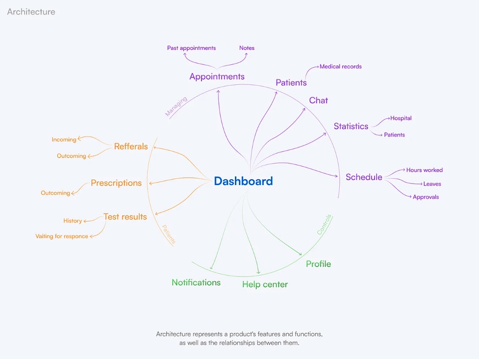
At Fireart, we apply the JTBD (jobs to be done) framework to define the specific decision-making capabilities required by different user roles. We also work on the architecture of the dashboard, tying up the product’s features and functions and relationships between them.
For example, a dashboard for a C-suite executive has a different job than one for an operations manager.
- Dashboard for the executives: monitoring first. Their job is to verify that KPIs are on track and make them visible at a 5-second glance. They require high-level aggregates and status indicators.
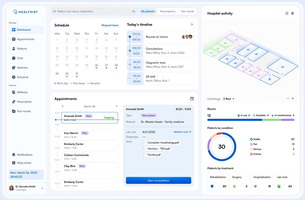
- Dashboard for the managers: analysis first. Their job is to see the roots of performance. They require drill-down capabilities and granular tables.
Trying to include both in a single view usually results in a product that frustrates everyone.
The "So what?" test
Once the audience is defined, we curate the data. We challenge every proposed metric with the "so what?" test. If a metric changes, does the user know what action to take? It helps you sort the metrics and pick the ones that really matter.
- Vanity metrics (e.g., "1 Million Total Page Views") look good but lack substance. They fail the “so what?” test because they do nothing for decision-making.
- Actionable metrics (e.g., "customer acquisition cost payback period") inform strategy . They drive specific operational moves (“we need to focus on customer retention of at least 3 months of engagement”).
Applying these strategic filters is one of the core effective principles of product design. Without this, UI will fail to deliver business value. True dashboard design principles dictate that every pixel must earn its place by facilitating a decision.
7 dashboard design best practices for clarity
Once the strategy is defined, we move to execution. This is where dashboard design principles translate into pixels. The difference between a good dashboard design and a chaotic one comes down to managing the user's attention.
At Fireart, we engineer the interface to match how the human brain processes visual information. Here are the core practices we follow to ensure comprehension.
1. Respect the 5-second rule for cognitive load
If a user cannot understand the status of their business within five seconds of loading the page, the design has failed.
Cognitive science tells us that working memory is limited. Every unnecessary gridline, heavy border, or decorative 3D effect adds extraneous cognitive load – wasting mental effort on deciphering the interface rather than understanding the data.
To pass the 5-second test, we practice reduction. We follow the concept of the data-ink ratio: if a pixel isn't displaying new information, it should be removed. We eliminate "chartjunk" like distracting background gradients or complex legends – to ensure the signal-to-noise ratio is high.
A clean interface is aesthetic, and it aids rapid decision making.
2. Leverage the "F-pattern" for visual hierarchy
You cannot rely on users to scan a dashboard randomly. Eye-tracking research shows that people scan screens in distinct patterns – most commonly an "F-pattern" for data-heavy interfaces. They scan the top line, read down the left side, and occasionally scan across again.
This biological reality dictates our layout strategy.
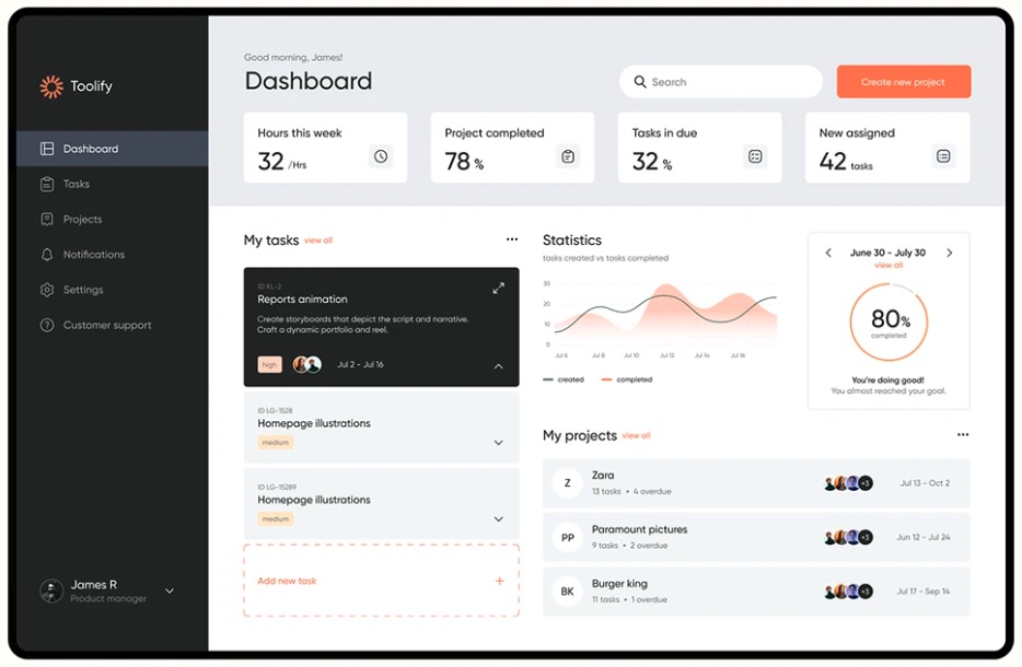
- The "golden triangle" (top-left) is the most valuable screen real estate. It is where North Star metrics (e.g., total revenue, system uptime) belong.
- The middle band is ideal for trends and comparative charts that explain the high-level metrics.
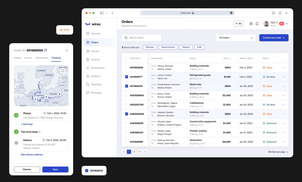
- The bottom-right is the graveyard of attention. We place granular data tables here, as users only look here when they are doing deep research.
By aligning the layout with natural scanning behavior, we ensure that the important alerts are never missed.
3. Use progressive disclosure
The most common request we get is, "Can we see everything on one screen?" Our answer is almost always, "You don't want that."
Cramming every metric into a single view creates the Frankenstein dashboard, that paralyzes the user. Instead, we use progressive disclosure. This technique structures information in layers:
- The overview: High-level aggregated KPIs.
- The context: Hover interactions that reveal trends or brief comparisons.
- The detail: Interactive elements that allow the user to click and go into a separate report or detailed table.
This approach balances the need for a quick summary with the need for depth, keeping the interface clean for both.
4. Choose the right visualization
Selecting the wrong chart type is the fastest way to mislead a user. Effective dashboard development requires respecting the visual perception. Avoid the “cool-looking” charts; choose the ones based on the data relationship instead.
- Demote the pie charts: it is difficult to tell a slice representing 20% from one representing 25%. A horizontal bar chart is almost always superior for comparing categories.
- Use line charts for trends: The eye naturally follows the continuity of a line to spot spikes or dips over time.
- Use bullet graphs for goals: Instead of gauges which look like speedometers, we prefer bullet graphs or simple progress bars. They take less space and convey target vs. actual performance better.
If you are struggling to move beyond standard charts, review some high-quality dashboard inspiration to see how other industries solve data density problems.
5. Remember to provide context
A number in isolation tells very little. If a dashboard says "Sales: $50,000," the user is forced to ask: "Is that good? Is it bad?" This increases cognitive load.
Every metric on a dashboard must pass the "compared to what?" test. To make data actionable, we always provide context directly alongside the value:
- Historical: "▲ 12% vs. Last Month"
- Target: "95% of Q3 Goal"
- Cohort: "vs. Industry Average"
These comparisons offload the work from the user's brain, speeding up decision making.
6. Stick to semantic colors
Color is a functional element, not a decoration. One of the biggest mistakes in dashboard ux best practices is using "traffic light" colors for non-status elements.
If you paint a bar chart red simply because it matches your brand, a user will instinctively think something is wrong. Reserve semantic colors for their specific meanings:
- Red: negative (warning, error, decline).
- Green: positive (success, growth, on track).
- Blue/neutral: categorical differentiation.
Remember to design for accessibility. Since ~8% of men and ~0.5% of women are colorblind, we never rely on color alone to convey status. We combine color with shape (e.g., a red and downward arrow) to make the message universally understood.
7. Design for mobile realities
Responsive dashboard design is notoriously difficult because large data tables don't scale down linearly to a phone screen.
Simply shrinking a table makes it unreadable. Instead, we use specific mobile patterns:
- The card stack: Transforming a table row into a vertical card component for easy scrolling.
- Priority columns: Hiding less critical columns on mobile to prevent horizontal scrolling.
- Simplified scope: A mobile dashboard shouldn't be a replica of the desktop version. It should be a curated view, focusing on high-level alerts and key metrics.
Common "anti-patterns" to avoid
Even with the best intentions, it is easy to fall into traps that ruin usability. Below is the list of design choices that seem intuitive might actually degrade the user experience.
The "metric soup"
A crowded, unstructured mess of every available data point displayed above the fold. If everything is important, nothing is. It dilutes the user's focus and leads to immediate analysis paralysis. A great dashboard is defined by what you choose to leave out.
False precision (decimal dust)
Displaying a conversion rate as 24.5932% adds cognitive noise, implying a level of accuracy that is statistically irrelevant. This forces the brain to process more digits to understand the number. For most business decisions, 24.6% is clearer, and just as useful.
The "lie factor"
Visual integrity matters. A common mistake is truncating the Y-axis (for example, starting a bar chart at 50 instead of 0 to make a small growth curve look explosive). It misleads the user. Good dashboard design principles prioritize truth over drama.
The gauge epidemic
Speedometer-style gauges are a relic. They occupy a massive amount of screen real estate just to display a single number. We always replace them with compact numbers or sparklines, which can convey the same information in 10% of the space.
Avoiding these mistakes early saves months of redesign.
Fireart can support you with a data-first product design concept that scales with your business.
Get a Data-First Design ConceptFuture-proofing: AI and the generative UI
As we speak, the static dashboards are becoming obsolete. The future of dashboard development is about intelligent adaptation.
At Fireart, we are closely watching the rise of generative UI (GenUI). Current dashboards are rigid, meaning the sales manager sees the same layout on day 1 of the quarter as they do on day 90. GenUI leverages AI to change the interface based on context.
If a user logs in during the final week of the quarter, the system automatically prioritizes "deal closing" metrics and "at-risk opportunities," pushing less relevant data to the background.
We are also moving from descriptive to prescriptive analytics. Instead of waiting for a user to notice a dip in retention, AI-driven "insight cards" will push alerts to the top of the dashboard. This shifts the role of the dashboard from a passive tool to an active business intelligence asset.
How Fireart approaches dashboard design
We don't believe in "cookie-cutter" templates. A dashboard that works for a logistics company will fail for a FinTech startup. That is why our approach to dashboard design is built on strategy and collaboration.
Our process begins with discovery. We ask, "What decisions do you need to make?" By mapping out the specific decision-making workflows of your users we ensure that every pixel on the screen serves a business purpose.
We then move to iterative prototyping. We validate our concepts, testing low-fidelity wireframes with real users to catch usability issues. This helps us refine the information architecture and visual hierarchy.
During thi phase, we collaborate closely with development teams to understand the technical constraints of data visualization, from API latency to data granularity. This ensures that our beautiful designs are actually feasible.
Whether you need a complete product overhaul or IT staff augmentation to scale your existing team, Fireart delivers interfaces that turn your data into a competitive superpower.
Conclusion
Effective dashboard design is about communication and flexibility. It balances strategic intent with the limitations of human cognition. By prioritizing clarity and avoiding metric soup, you can transform your dashboard from a static report into a dynamic tool for growth.
Ready to create a dashboard that empowers smarter decisions? Fireart’s design team can turn your data into a powerful user experience.
Contact us todayFAQ: Common questions about dashboard design
What factors influence the final cost of dashboard UI/UX design?
The complexity of the data is the main driver. A simple status board with 5 metrics is faster to design than a complex analytical solution with multiple drill-down layers, customizable widgets, and role-based views.u003c!u002du002d notionvc: e7670f40-3cca-4058-8392-1017c6f52f18 u002du002du003e
Can you redesign an existing dashboard without rebuilding the whole product?
Yes. We often perform a u0022UX facelift.u0022 We can improve the visual hierarchy and layout to solve usability issues without changing the backend or data structure.-
How do I know if my dashboard needs a full redesign or just UX optimization?
If users are complaining about u0022clutteru0022 or u0022ugly colors,u0022 it might just need optimization. If users are ignoring the dashboard entirely or using spreadsheets instead, you likely need a strategic redesign of the workflow.u003c!u002du002d notionvc: 18445b22-5287-4c62-a9ab-7ac2e8007a6c u002du002du003e
What is the difference between vanity and actionable metrics?
Vanity metrics (e.g., u0022total page viewsu0022) look good but don’t tell you what to do. Actionable metrics (e.g., u0022conversion rate per traffic sourceu0022) provide context and inform your next move.-u003c!u002du002d notionvc: 4dd3b14f-f07f-4d6a-a834-2f883919af1e u002du002du003e
Does Fireart handle both the UX strategy and the UI visuals for dashboards?
Yes. We guide you through the entire process, from defining the job to be done and selecting the right KPIs (UX strategy) to creating the interface (UI design) that your developers can build.u003c!u002du002d notionvc: ee935e57-6fad-4616-896f-1ae11d8b2ec0 u002du002du003e


